How to Format Files For Your Website
When uploading images to your site, follow these guidelines:
| Image Attribute | Specification | Note |
| File Type | Only .jpg, .gif, or .png | .pdf, .psd, and .doc files aren’t compatible |
| File Size | 20 MB limit | Use images 500 KB or less for best results |
| File Name | Only use letters, numbers, underscores, and hyphens | Accented letters, question marks, percent signs, and ampersands may not upload or cause unexpected issues |
| Resolution | 60 MP (megapixel) limit | To find your image resolution, multiply the dimensions and divide by 1 million. For example, an image that’s 1500 px x 1650 px is 2.47 MP |
| Color Mode | RGB (Red, Green, Blue) | CMYK color mode is only for printed materials and won’t appear correctly in most browsers |
| Color Profile | sRGB | If images don’t look right on mobile devices, they may not have an sRGB color profile |
Image Best Practices
File Size
We recommend using image files of less than 500 KB for best results, though the limit for an individual image upload is 20 MB. When it comes to image size, bigger isn’t always better, as uploading multiple large images can affect site performance. If you’re adding multiple images to a page, keep your overall page size in mind.
Image Width
The dimensions of the original image you upload to your site can have a big impact on how it displays. We recommend using images that are between 1200 and 2500 pixels wide, with the exception of square images being 800×800
- Images smaller than 1200 pixels may appear blurry or pixelated when they stretch to fill containers, such as banners.
Image Cropping
Crop the image in a way that would keep the content’s focal point in view when the site adjusts for resolution and platform.
Image Text
Whenever possible we recommend adding text as an overlay instead of including it within the image. This makes the text searchable and keeps it visible if the image crops on smaller devices.
Image Names
An image’s name acts as alt text if there isn’t any other alt text provided. It also tells search engines what the image is about, which makes it more likely that you’ll show up in image searches. Making sure the image name is clear and each word is separated by hyphens (a-name-like-this.jpg) will greatly improve search performance.
Page Size
Even if all your photos are under 500 KB, if you have a large number of images on a page it can cause issues such as slow loading speeds. Check your page content to ensure your page size is 5 MB or under.
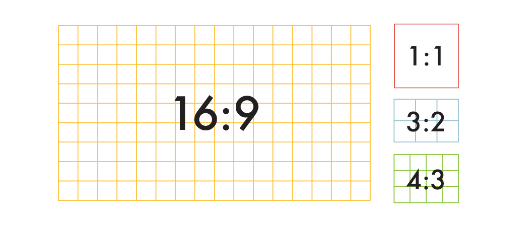
Common Aspect Ratios

1:1 Ratio
A 1:1 ratio means that an image’s width and height are equal, creating a square. Some common 1:1 ratios are an 8 x 8 inch photo, a 800 x 800 pixel image, or typically any profile picture template on social media sites (think Facebook). This aspect ratio is commonly used for print photographs, mobile screens, and social media platforms, but it’s not ideal for most TV or digital formats.
3:2 Ratio
The 3:2 ratio has roots in 35 millimeter film and photography and is still widely used for print sizes. Images framed at 1080 x 720 pixels or 6 x 4 inches are set within this aspect ratio.
4:3 Ratio
A 4:3 ratio is typically used for TV displays, computer monitors, and digital cameras. For every 4 units of width, there are 3 units of height, creating a rectangular shape. An image sized at 1024 x 768 pixels or 8 x 6 inches fits a typical 4:3 ratio.
16:9 Ratio
The 16:9 ratio is mostly seen on presentation slides, computer monitors, or widescreen TVs. This international standard recently replaced the 4:3 ratio for monitors and TV screens, creating a slimmer, more elongated rectangular shape compared to the 4:3 format. Common resolutions in the 16:9 ratio are 1920 x 1080 pixels and 1280 x 720 pixels.
Common Image Sizes for Web
If you are uploading images on the web, it’s crucial to understand image size specifications because incorrect image sizes may stretch or distort to fill fixed dimensions.
When you’re working on a website builder or content management system (CMS), like WordPress, the image size requirements will vary according to the theme or template you’re using. Often, the website builder will resize images for you so that they display correctly in several different formats. To therefore satisfy several different standard image sizes, upload an image that’s big enough to reduce without losing resolution and small enough to comfortably fit the width of a standard screen. Squarespace recommends uploading images between 1200 and 2500 pixels wide.
1920 x 1080 pixels
This standard image size is widely seen across high definition TVs, presentations, and social media cover photos. It follows the 16:9 aspect ratio.
1280 x 720 pixels
This size follows the standard HD format featured in photography and film. It fits the 16:9 aspect ratio.
800 x 800 pixels
You’ll see this 1:1 ratio image size used widely across social media, namely Instagram and Facebook posts.
